

Your Cart is Empty


About the art:
I’ve never been the most talented musician in the bands I’ve been in. I haven’t even always been the best guitar player when I was the only one playing guitar in bands I started. I’ve always tried to make up for it by being on time, having decent reliable equipment, and doing art for whatever I was doing when the inspiration hit me. I liked how band art could add weight to a bands momentum, add gravitas to worthy, yet rudimentary ideas. I liked the idea of being in a band, but how would anyone know I had ever been in a band if I didn’t have something tangible to prove it?
My first band, Carry Nation had practiced about 4-5 times before breaking up so it seemed like I had to act fast if I were to ever have our own shirts. We (NFAA) had never played a show and were probably making it through about 4 out of every 5 songs we played before the song inevitably fell apart.
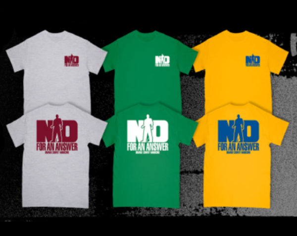
This, to me is really a distillation of what we wanted to be. Looking at it today, it seems glaringly obvious what I was thinking and what the motivations were. This was a time before every band playing shows marketed themselves. I just selfishly wanted proof I had been in a band. I really wanted a shirt that would be iconic and independent of the time it was created. I wanted it to be something dorks like me would cherish like the shirts the Necros had with the skeleton and swords (easily my favorite hardcore shirt), the SNFU shirt with the open your mouth and say SNFU, and the Yellow “Jaws” shirt I had when I was 8 - at least a decade before I could bring myself to watch the movie. The girl getting bit (I’m guessing in half) in the commercial and hyperventilating was way too gruesome for me to contemplate.
As for the design, I wanted it to me simple and visible from a distance. This necessitated big shapes and as a result, a lot of ink to deal with in my first foray into screen-printing. Of the first couple dozen shirts, I would imagine the ink is all that remains. Print density was definitely a priority and tended to keep the first two dozen from being able to be folded. When you wore an original No for an Answer shirt your back would usually produce a No for an Answer shaped puddle just beneath the print. The white was seriously white though.

The art was inspired by an artist named Micheal Schwab. I had always liked his work and the stance felt very iconic, but not bald enough. The inspiration was (I believe) on the cover of a design magazine I had at the time. In retrospect, it seems obvious to me that the size and placement of the “NO” was influenced by the iconic Uniform Choice shirts of the time. I never really loved front prints and the early color ways kind of made me nauseous, so most of the art would be on the back in black and white as opposed to the light blues, greens, and yellows the early UC shirts employed. It was also intended to not look punk or hardcore and look serious. I wanted it to be sort of subversive in that, the simplicity might inspire a conversation. Even though these were some of my best friends and John Mastropaulo, we always made each other laugh even though there was an outward facing rigidity we apparently embraced. The condensed type beneath the “NO” was a nod to Dischord’s use of Franklin Gothic and flyers from early DC and Boston flyers. “Orange County” was important to me because, well, we didn’t want to be confused with all the other No for an Answers that were flooding the countryside. A song title either never occurred to me or may not have even existed yet. It was pretty early on.
Not long after we had begun playing shows, I was informed that a friend of the band, Dave Brooks would be taking my screens and hence forth be printing our shirts. He did a much better job than I ever could, but this turned out to be a source of conflict later. That was probably ‘87 or early ‘88 and I haven’t printed one of these since.
- Gavin Oglesby